Gutenberg’s Columns: a beginner guide on how to use it

One of the most difficult things to achieve when using the old editor of WordPress was creating a column for the posts. It usually meant that you’d need to use some HTML code around your texts and images that you had previously created in order to make it work.
Gutenberg project, then, thoughts that it would be something to care about when creating a completely new editor. What if people had the ability to add a lot of different columns on their site, posts, pages, and then make the content shine in many different ways?
That’s what we have now! The Gutenberg team developed a block called Columns – if you do not know what a block is, you can click here to read our post about blocks and Gutenberg. With this block, you can add different columns on your site, creating numerous options for designing your pages.
Also important is that your theme supports the columns. It means that your theme developers should have developed the columns system on your site too. Fortunately, our themes support this feature out of the box, so you can use one of our themes and you’ll be able to use this functionality. You can see our theme by clicking here.
Let’s create a few columns now!
Columns Block
To use the columns block, you can click on the + sign on the left side of the text (if you don’t know where it is, you can check our previous post about Gutenberg here), or you can type /columns and hit enter. After you do that, you’ll now see a block like the following:

Look how interesting this new block it. We have now 5 different columns styles to use: two equal parts, right side greater than the left side, left side greater than the right size, three equal parts, three parts with the medium one being the largest part.
You may be asking yourself: “what if?”. Well, I’ll show you what kind of amazing things you can do with these columns. Let’s do it!
My first column
Let’s start by using the two equal sides. When you select the first element of the columns block, you’ll see two fields like the ones below. Each plus sign (+) means one side of the column to which you can whatever you want: text, images, galleries, etc.

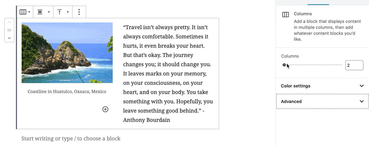
Now, as an example, let’s say we want a page with an image on the left side with a text on the right side of the text, explaining this image (it’s a pretty common request from people that have blogs because they want to create grids with contents on their website).
This is how it will look on your editing page:

And here is how it will look on your site – in case you are using Salzburg Blog theme:

We encourage you to play around with the columns and test all the possibilities – there a lot of customization that you can make. You can see a few more examples by checking our demo of the Salzburg Blog theme here.
Settings
When using columns with the same width, the first setting you can define is the number of columns you’ll use. We’ve added a gif image, so you can see how to do it.
You can also set the colors for your columns in the setting below:

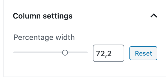
Last but not least, if you choose to use the three parts option, there will be a field called Column settings. There you’ll be able to work on the percentage of the width of each column.
It means that, if you want to play around with the widths of the columns, you can do it out of the box!
You can do that by adding a new column, then clicking on Column settings and selecting the widths that you want.

FAQ on Gutenberg’s Columns
Will it work out of the box?
The column functionality comes out of the box for use on your website if you keep the Gutenberg as your editor.
However, your website needs to be programmed to render these columns. Your CSS should have the needed styles.
How many columns can I have?
The maximum number of columns you can have is 6. Bear in mind that a lot of columns can make it hard to read, so, it’s up to you to choose how many columns you want, but take care! ?
Is my theme prepared to use columns?
Well, the best thing to do here is to test. Not all the themes support the columns, so I suggest you create a fake post or page and add a few columns. After that, click to view the draft – do not publish the page. If it breaks your layout, it’s not prepared.
If it breaks your site, you can reach out your developer to fix it or ask the theme developer to implement a few styles to the theme.
Conclusion
The columns block is really powerful and can help you to create AMAZING layouts. If you want a theme that lets you create your columns, try out Salzburg Blog theme – a minimal, elegant, and modern personal blog theme.